


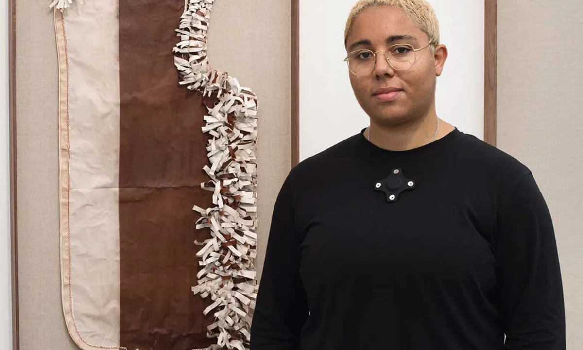
Earlier this month, the Institute of Contemporary Arts (ICA) in London opened Morale Patch, an exhibition of new work by the Plymouth-born multimedia artist Tanoa Sasraku. The show is oriented around Watchlist, a new commission comprising a collectaion of branded trinkets from oil companies, and Subdued Morale Patch, a series of experimental works on paper for which Sasraku has developed a novel printing technique using water and ultraviolet (UV) light.
A thread that connects Sasraku’s work is an interest in raw materials; specifically, how they connect with landscapes and how they operate within works of art. In the past she has used ancient pigments foraged from different corners of the British Isles. For the work seen here, Sasraku’s starting point is another primordial substance: crude oil, which becomes a vehicle to explore themes of national identity and conflict.
The Art Newspaper:A morale patch is a sort of fun, unofficial piece of military insignia made by soldiers for each other to wear, often an embroidered patch. Why did you choose it for the show’s title?
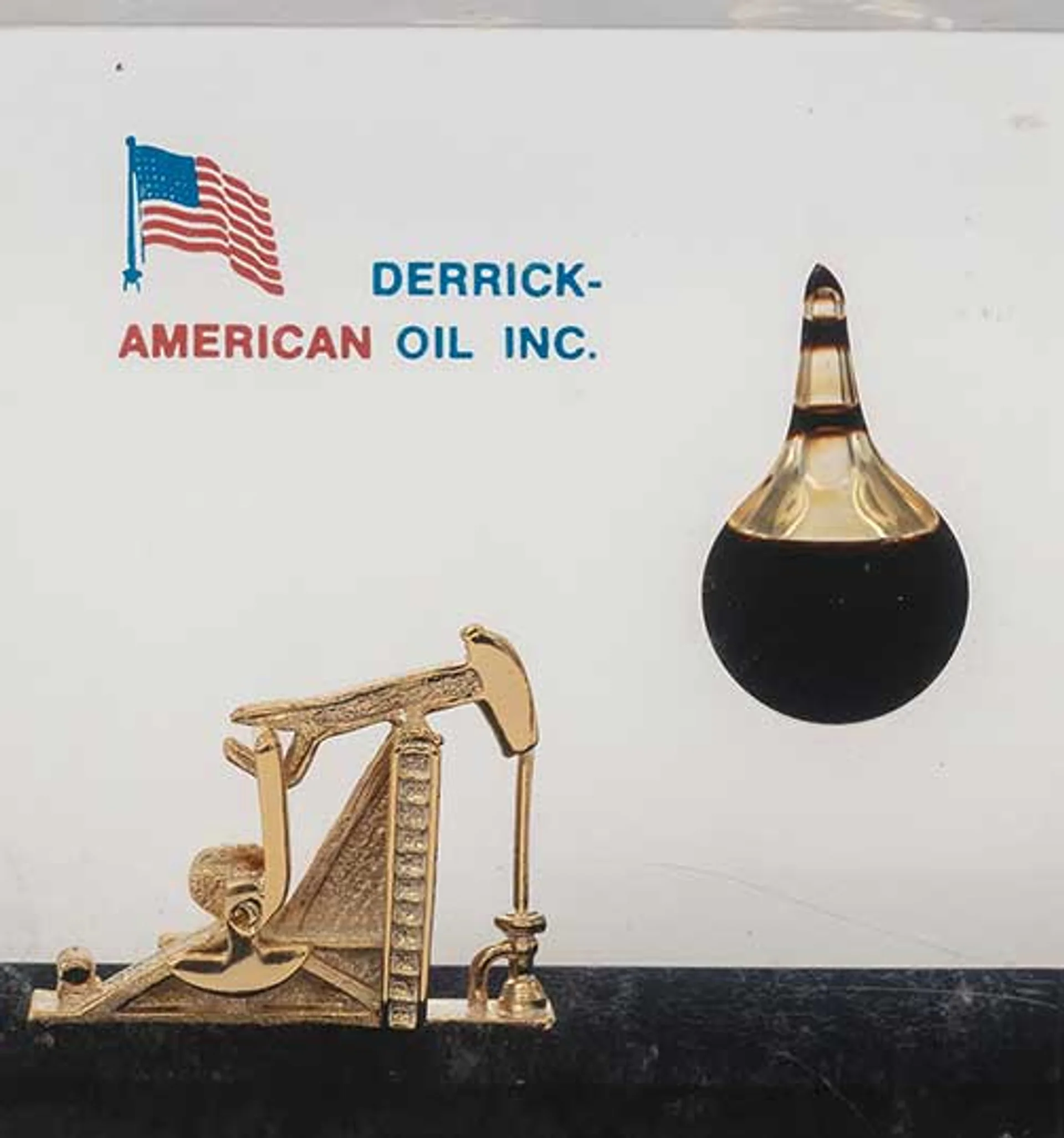
Tanoa Sasraku: Over the past two years I’ve been collecting both personalised military ephemera—morale patches, medal ribbon bars, hand-painted armour, scrapbooks—and corporate mementos and trinkets from the oil industry, specifically these crude-oil filled paperweights. The phrase “morale patch” felt like a term that united the functions of the paperweights and, particularly, the ribbon bars. Both are distributed to veterans of those industries to try and attach meaning and order to working lives which are defined by the chaotic whims of politicians and bureaucrats.
How did you find the paperweights?
I was initially just curious to see if I could buy crude oil online; to see how accessible it is to the average civilian. Instead of yielding a bottle of crude oil, the first result on eBay was one of these paperweights: a clear acrylic cube with a sand-coloured layer at the bottom. Embedded within it, is a blown-glass teardrop chamber that contains crude oil. I just thought it was the perfect little landscape sculpture.
Sasraku’s A Tower to Say Goodbye (2024) was partially created by exposing newsprint to UV light, and is designed to fade over time
Photo: Jack Elliot Edwards; courtesy the artist and Vardaxoglou Gallery
They also immediately struck me as having this reliquary effect to them; they require a level of belief that it is crude oil from where it says it’s from. I wanted this show to explore mineral worship—humans’ relationships to minerals—so they felt like a really good starting point.
They’re displayed in a chessboard-like arrangement in the installation Watchlist. Why did you choose that configuration?
I’d amassed about 40 of them and was keen for them not to just appear like a collection display. They really needed to feel activated, charged and relational. I started categorising them by form and realised there was a real hierarchy in terms of the design, from the basic cube forms to a few that were very rare and quite strange in their design. That helped me to orient them as chess pieces. I realised that each paperweight is a stand-in for a country, which was a useful way to 3D map alliances between nations, so there was a conceptual impetus too.
You recently moved from London to Glasgow. Has that had any impact on the work you are producing?
As I started looking into oil and thinking about how Scotland’s industrial history—oil rigs in the North Sea and ironworks—has been so essential to securing Britain’s position as a world power following the collapse of the empire, I felt like it was time to actually situate myself in the context of these materials that I work with rather than always thinking about them in the abstract from London. I’ve always considered it really important to get out of the studio, which can be this kind of vacuum, and into the field where I can engage with my materials, so it felt like a natural move in that way. It’s been really helpful for this project.
Another body of work in the exhibition, Subdued Morale Patch, comprises works on newsprint that are faint to the point of being illegible. Can you tell me about these works?
The reference point for those works was military medal ribbon bars, which are these small, compressed colour-bands, that often have associations with national flags and the terrain upon which different wars are fought. The Subdued Morale Patch works are essentially blown-up medal ribbon bars, made using blank piles of newsprint, which I’ve marked using UV [ultraviolet light] and water.
Colour is brought into them through document binder clips, which form a mosaic around the edges, referencing colours associated with different wars—particularly oil wars from the last 50 years. I was thinking a lot about those bureaucrats and politicians who might be in their offices, basking in second-hand military glory. I wanted to find a way to pull office ephemera into the idea of military decoration.
Both bodies of work feel like pale imitations of some huge, traumatic event.
Yeah, they’re kind of flaccid stand-ins. The paperweights are rendered redundant in the show, because all the piles of paper are fixed with clips. And the clipped works contain no information, or the information is kind of fading from view. I want it to feel like there are these failed attempts at functionality.
How does the printing process work with just UV and water?
I’ve been conducting a lot of experiments over the past couple of years to see how you can capture, develop and then fix a photograph on paper without any chemicals, just using the substrate, light and water. Newsprint is normally quite throwaway and a non-art material because it’s light-sensitive. I really wanted to pull that out and harness that.
I needed a really concentrated form of UV to work in this way, so I bought a tanning bed. I make acetate negatives that I then place on top of the newsprint and just fire the sunbed at it for a day. You get a really beautiful, quite unique image that’s rendered in sepia. I then dip the paper in water, which seems to semi-fix the image—I don’t know why, I guess it does something to its chemical structure. Over time, they’re designed to shift and fade.

A detail of Watchlist (2025), consisting of paperweights encasing crude oil
Photo: Jack Elliot Edwards; courtesy the artist
Most artistic mediums are designed to remain in the same state for as long as possible. What is the significance of your choice to do the opposite here?
I’m very conscious about how I use materials and what their lifespan is and that’s been the case with all of my newsprint works previously. I want them to relate to the human body in a way, I don’t use heavily archival materials because I want these works to live with people and to change almost at a similar, albeit slowed down, rate. They’re an experiment. I’m trying to develop these novel processes to make these photographic-sculpture hybrids that are sensitive to their environment. I guess we’ll see in 50 years what’s happened to them.
Is it an act of resistance against museums to make work that’s sort of conservator-proof, where the slow march of time is built into it?
I don’t necessarily think about them as resistant to the institution in that way, but I see these works as quite un-egotistical in terms of just how things are produced in our world now and this drive for immortality. I don’t need to live forever and I don’t see that the work needs to either.
• Tanoa Sasraku: Morale Patch, Institute of Contemporary Arts, London, until 11 January 2026


